About
Me

Hi, I am Leonardo, and since I was a child I have been attracted by the world of graphics and communication in general. Over the years, this passion has grown and has finally found its way thanks to the university experience. I am particularly interested in everything related to web design, motion design and UX / UI
One of the aspects that fascinates me in every project is the possibility to broaden my skills and learn new things while having fun.
- Name
- Leonardo Scarpa
- (Leo for friends)
- Born
- 12 January 1997
- Distinguishing marks
- I dedicate seriousness and commitment to complete a project and I love to get involved in it.
- Languages
- english (b1)
- Software
- Visual Studio Code
- After Effects
- Premiere Pro
- Adobe XD
- Illustrator
- Photoshop
- InDesign
- Protopie
- Alias
EDUCATION
2011-2016
High SchoolLiceo G.Veronese - Chioggia
2017-2020
Diploma in product and visual design IUAV - Venice
EXPERIENCES
09-11.2020
Curricular intershipCerebroids srls - Solid Venice
Skill
BRAND
IDENTITY

A good brand identity is like a tailored suit for your company, it doesn't go unnoticed.
WEB
DESIGN

UX/UI, responsive design, usability, user journey, code, what a fascinating world!
MOTION
GRAPHIC

I love playing with keyframes to make animation smooth and enjoyable.
GRAPHIC
DESIGN

It's always an exciting challenge to convey a message through a symbol, a layout or a composition.

"It's not just what it looks like and feels like. Design is how it works."
[Steve Jobs]

Projects
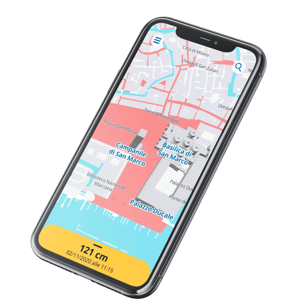
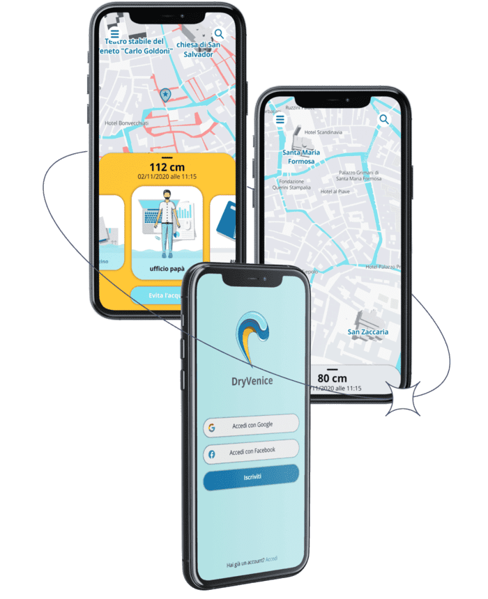
DryVenice
web app
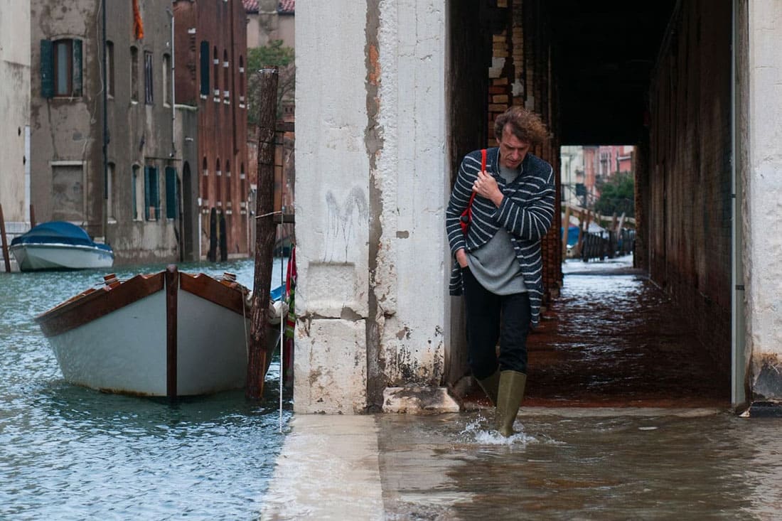
contest
Mobile app for a better management of the tidal phenomenon in Venice
Briefing
Difficulty in avoiding flooded areas. - Reliability of forecasts due to weather conditions. - Difficulty in interpreting elevation data.
Solution
View flooded areas. - Reported presence of unfavorable weather elements. - Data comparable directly with the user.
Easily navigable
Minimize unnecessary waste of time in uncomfortable situations.
Customizable
Create a customized user service through a system of "rooms" to guarantee the understanding of the phenomenon.
Evaluable and improvable
To make the service more accurate and improve the user experience by sending feedback.
The user customizes their avatar, which will later be used within the application. All this allows the user to identify as much as possible with the created character.
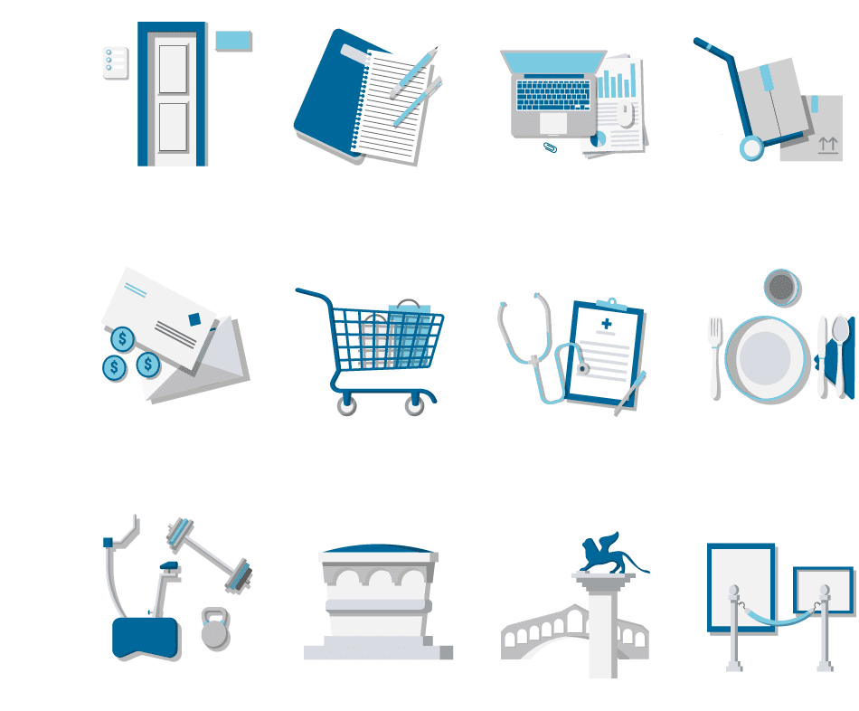
The application allows to add your places of interest so you can always check them. The user can customize the rooms with 12 different illustrated backgrounds that will help him to find the saved place.
Thanks to the avatar, you can check at what height the water would reach if you were there.
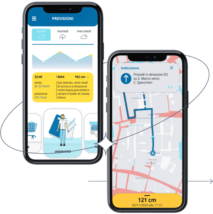
The user is informed about the presence of possible atmospheric phenomena that could affect the forecasts. The service allows you to set up an itinerary to avoid water. and create a route for a future time by choosing one of the previously saved places as the place of departure or arrival.
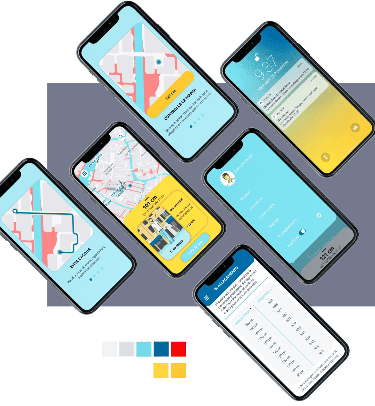
The logo is the union of the classic locator, that can be seen on maps, and water element. I wanted to highlight the main function of the service, which is locating the flooded areas in order to avoid them.
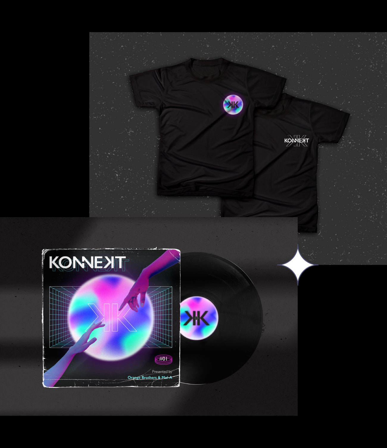
konnekt
logo and artwork
client
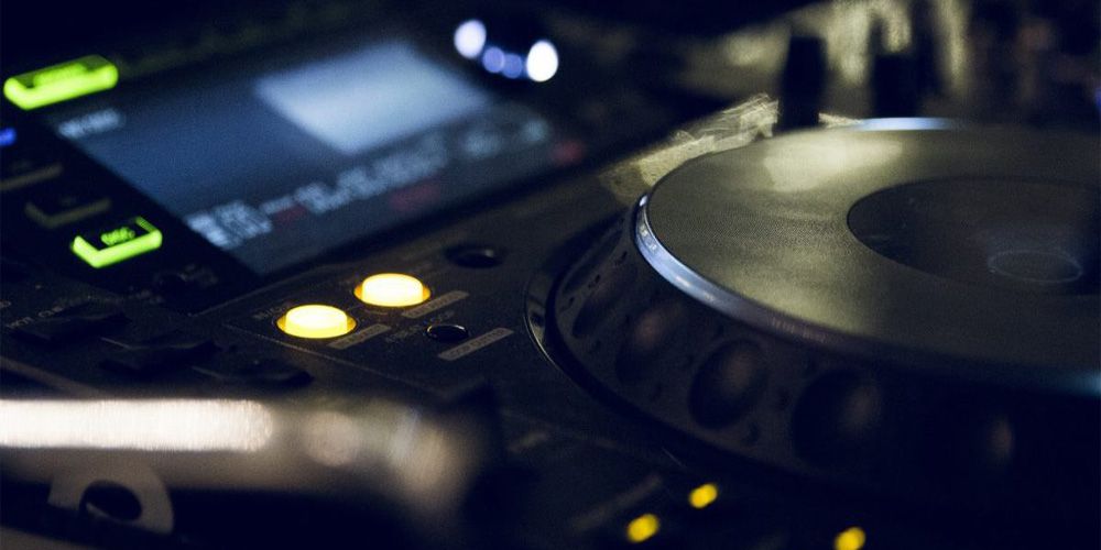
A tecnho podcast
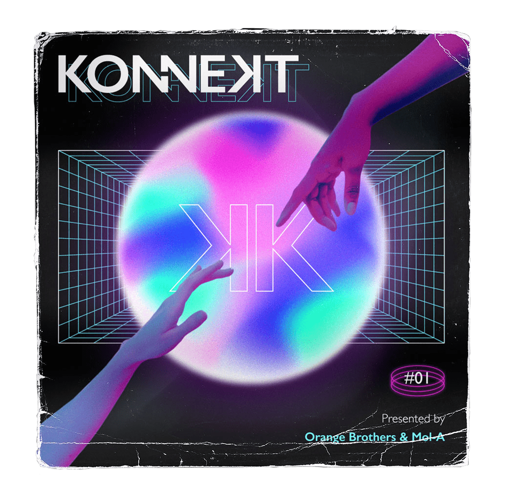
Contest
A sense of contact,underlined by the name, must emerge from the artwork and the logo.
Solution
playing with the idea of two separate identities trying to touch each other
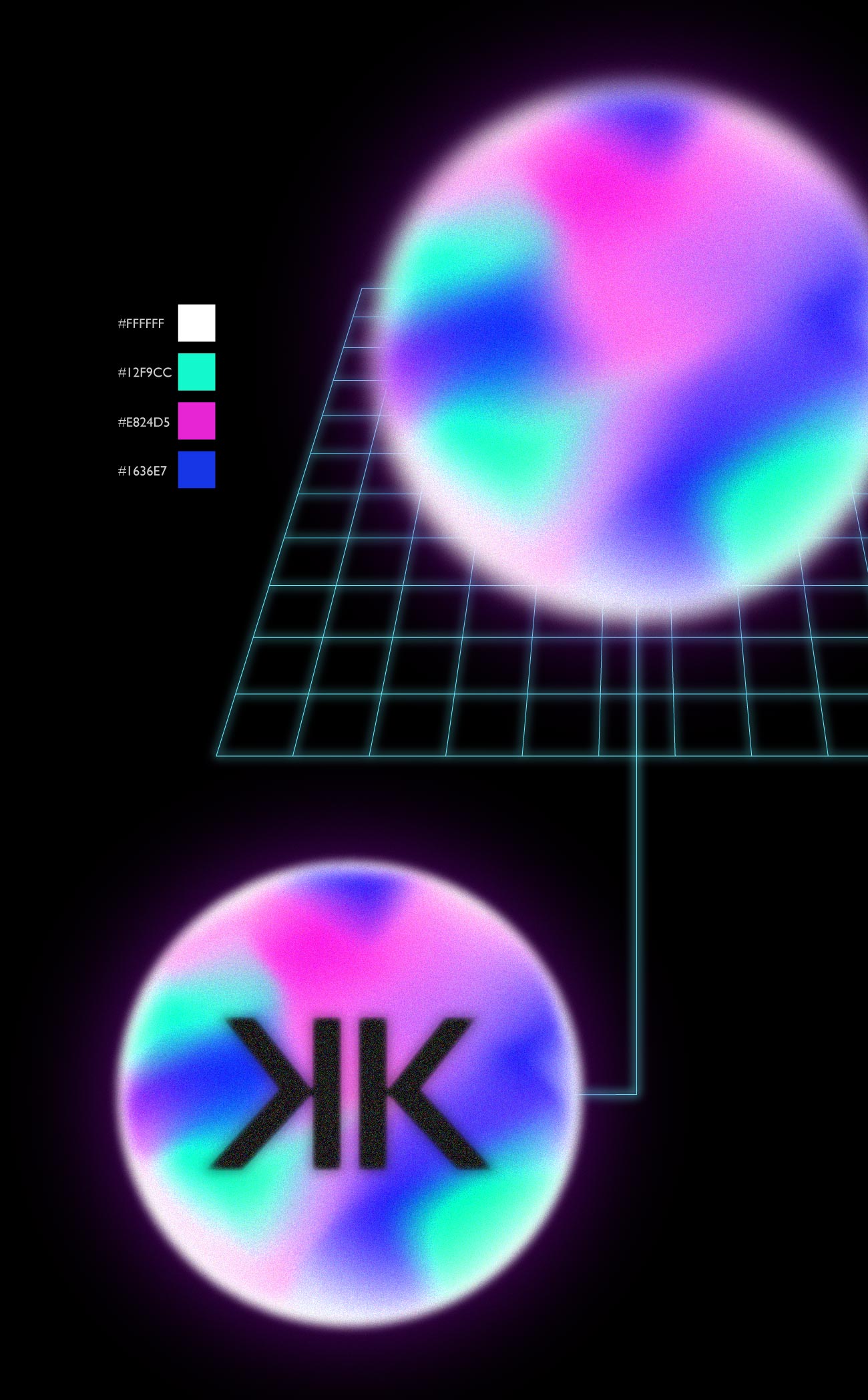
The logotype exploits the concept of connection that transpires from the name.The double “N” letters are therefore almost completely united; they remain separated only by a narrow space still making them appearing as two separate entities, but in the act of touching and joining each other. The font I used is Gill Sans, a modern font without serif, but with a human feel.

To reinforce the message, the whole artwork is pervaded by a mysterious aura, almost otherworldly. A contact with something bigger and unattainable, as underlined by the luminous sphere in the center, similar to a planet. Some graphic signs transport the composition into a sort of cyberspace while the bright colors make the composition stand out from the darkness of the space.
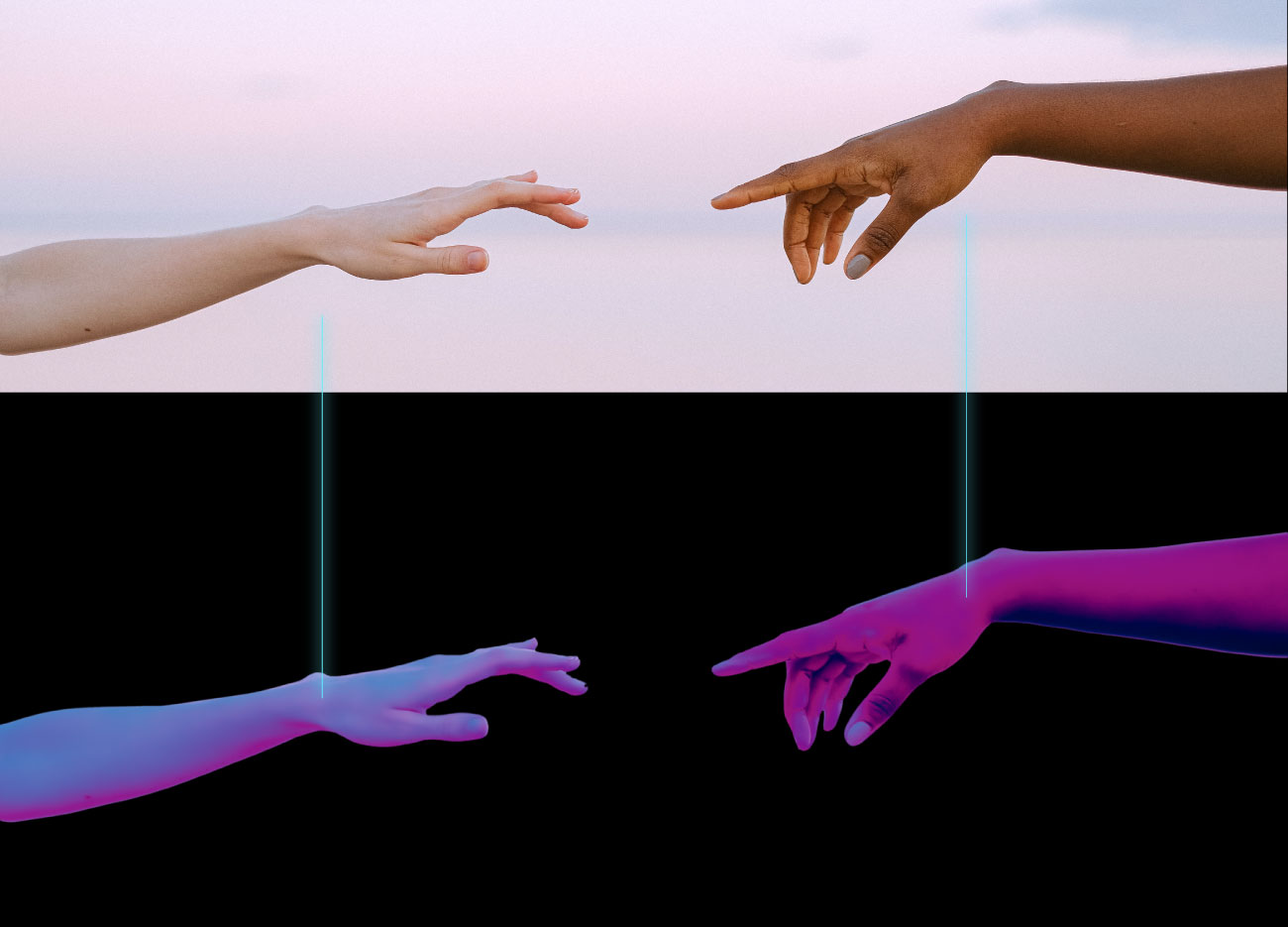
The idea of connection is further emphasized through two hands photographed in the act of touching each other, but still too far apart. Once again, two different entities want a direct contact. The composition has been revised through colors that transport it into a dream dimension, to underline a contact with something otherworldly.
Vi.sca
logo and business card
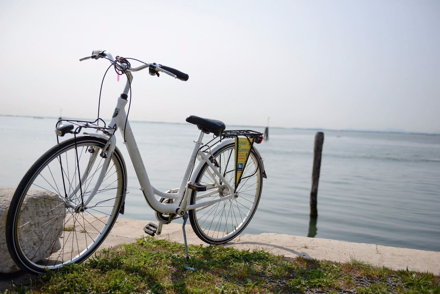
client
mechanical workshop that offers various services, including the possibility to rent bicycles.
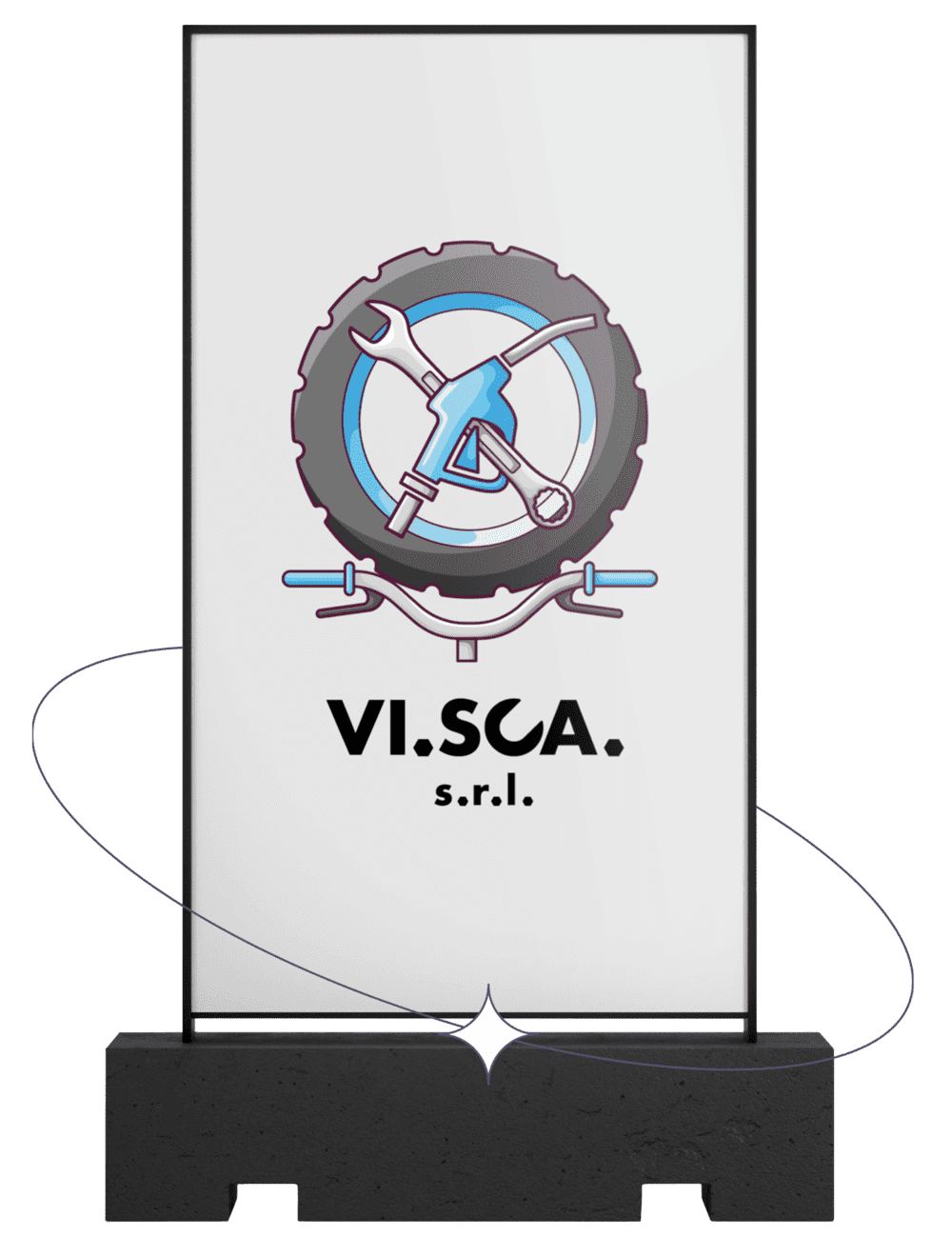
Contest
Necessity to view immediately all the services provided; high recognition.
Solution
I decided to play with letters that compone the company name and the classic mechanic's tool, the wrench, to create a shape that combined both components.
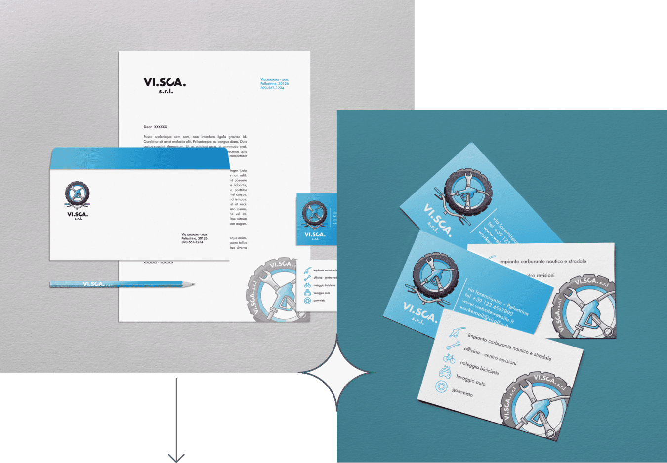

Font
For a good legibility, the shape created had to have the same proportions as the chosen font, or it could appear as something different.
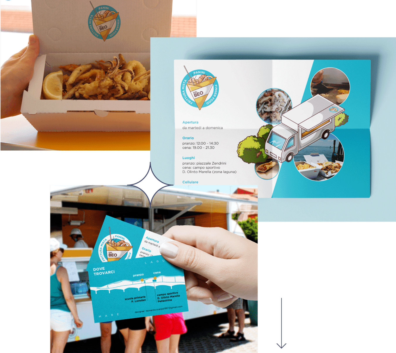
Dal Beo
logo and business card
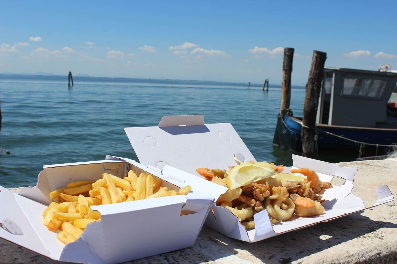
client
Food truck whose "take away" mixed fried fish became its strong point.
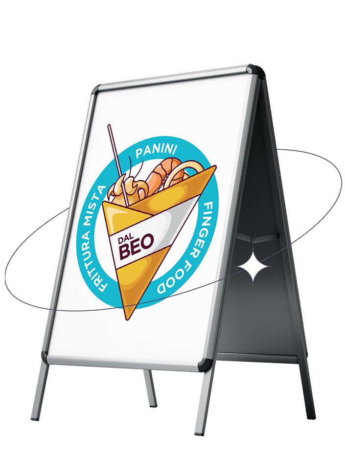
Contest
The customer wanted a logo that emphasized his main dish and his practicality.
Solution
I choose to represent it in a stylized way, highlighting the convenience of the take away "cone" format (very popular in Italy); The "cartoon" style in the flyer has been done by isometric projection.